PrinciplePrinciple
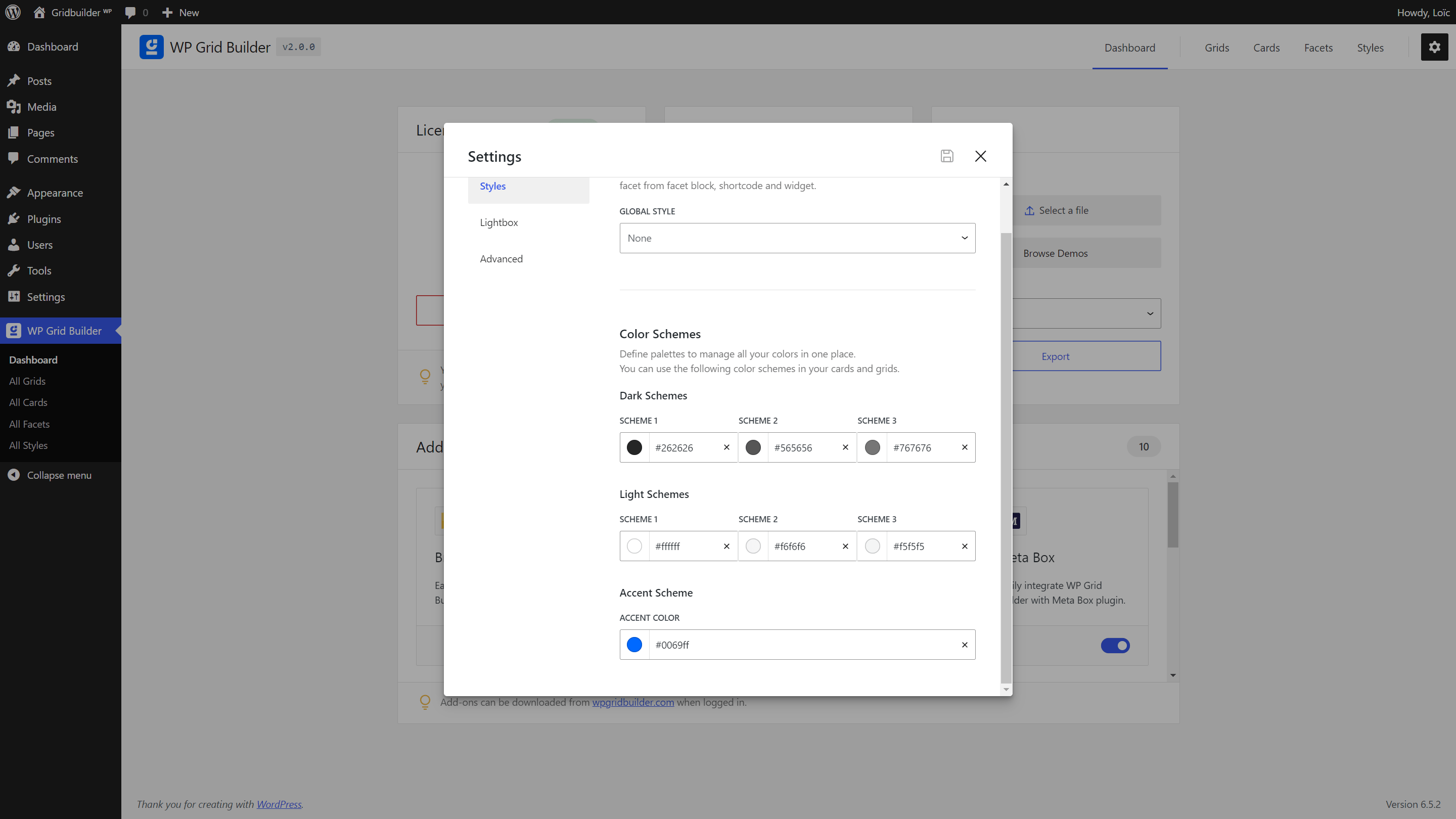
WP Grid Builder works with color schemes for cards and facets.
Color schemes allows to control main colors in one place for all your cards and facets. It is a great way to easily manage colors globally.
You can set color schemes in the Settings panel of the plugin.
Card BuilderCard Builder
In the card builder, you will be able for each block to setup font color from one of the color scheme set in Settings of the plugin.
The font color scheme will be overriden if you set a custom color thanks to the color picker.
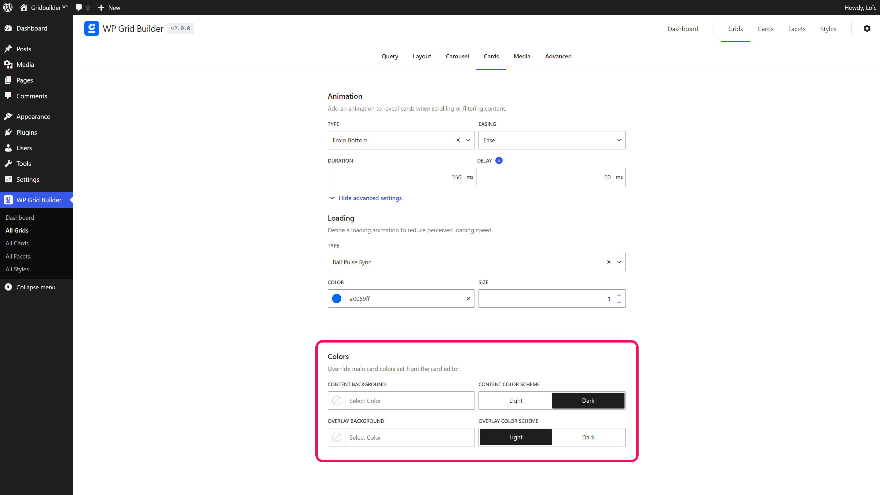
By default, the header, body and footer content blocks of a card use a dark scheme (black text, white background). And the overlay content blocks use a light scheme (white text). These schemes can be changed in your grid settings under Cards panel. It allows to use the same card in different grids with different color schemes. If you wish to remove the default background color set on the header, body, or footer, you need to set the color to ‘transparent’ in the card editor.
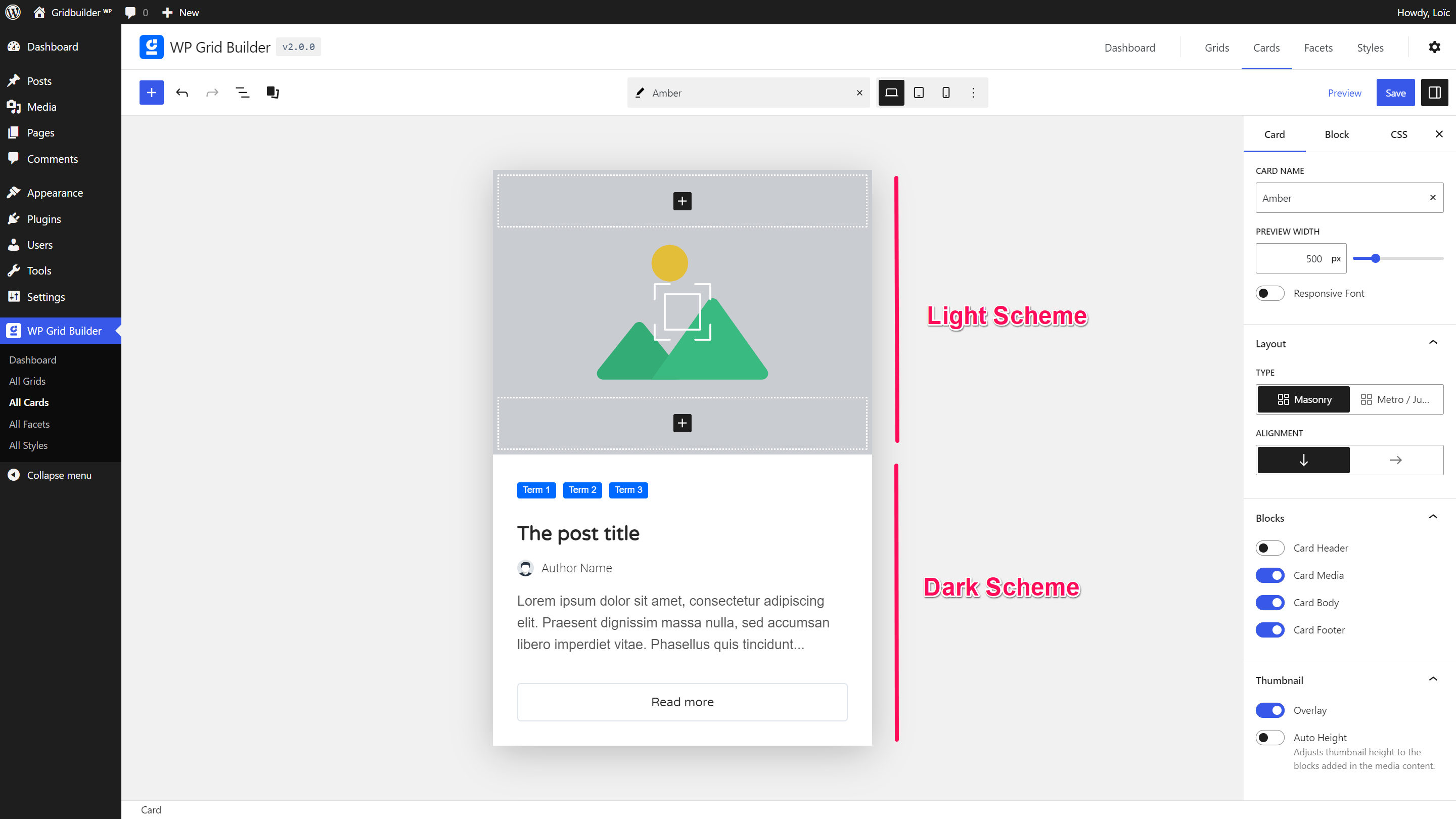
Color schemes in cards are optionals and it is just a feature for convenience. You are free to ignore this system and set your own colors as you want.
FacetsFacets
Accent color is used in Facets in order to apply colors to selected checkbox, radio, button, range, load more and pagination facets.